Currently open for work
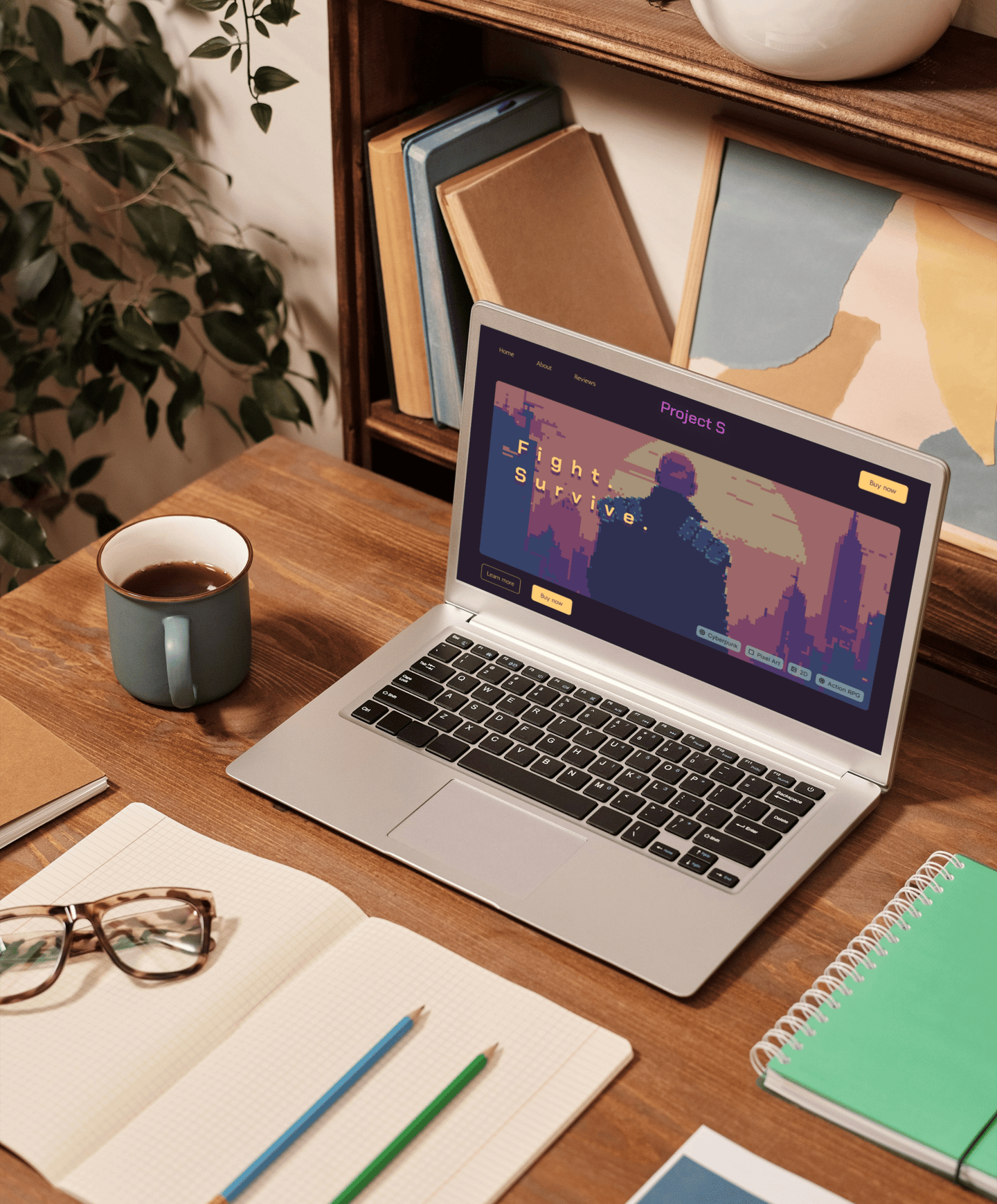
This project was commissioned by a Danish indie game studio planning to launch their project, Project S. To attract more players and boost sales, they wanted to develop a landing page displaying information about their game and offering purchase options.
Summary
My contribution
As a web designer, I focused fully on building the design system, wireframes, and a working prototype. After that, I transferred the designs to code and launched the website. By the end of the project, I delivered both low- and high-fidelity wireframes, a component kit, a Figma prototype, and a fully working landing page, ready for its audience.
Services provided:
Figma design: wireframes, component kit
Art Direction: design and execution
Programming: HTML, CSS, JavaScript
Competitor research, analysis, and comparison
Webflow development
Mission
Collaborated with
Game developers
My role
Web Designer


I started by researching similar landing pages -- dedicated to specific videogames -- and analyzing their style and approach. Through my research, I identified a suitable design and colors and devised the overall structure of the future landing page. For simplicity, my client and I decided to settle on a simplistic approach, focusing specifically on the landing page without adding anything extra.
I created a style tile based on the game's style (pixel art) and color palette. I also created a logo for the game using Illustrator. After that, I moved on to wireframe and user flow development.
Process & Strategy
Wireframe Development
Research & Structure
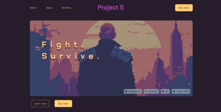
During flow and development and wireframing, I focused on keeping our interface simple, easy to navigate, but appealing. To achieve this, I created simple line icons and used only the primary colors of the game's brand. I made sure to maintain a consistent look using grids and components and creating instances. This helped achieve a polished, modern look while ensuring uniformity across all screens.
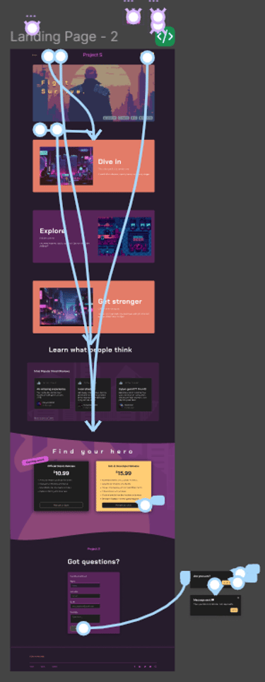
I created a medium-fidelity and high-fidelity wireframe for the landing page, added animations, user interactions, and pop-up windows. This included:
Nav bar, hero section
Main section with game screenshots and 'hooks' to engage the readers
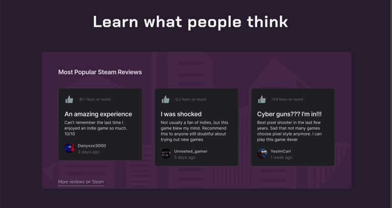
Review section with popular Steam reviews
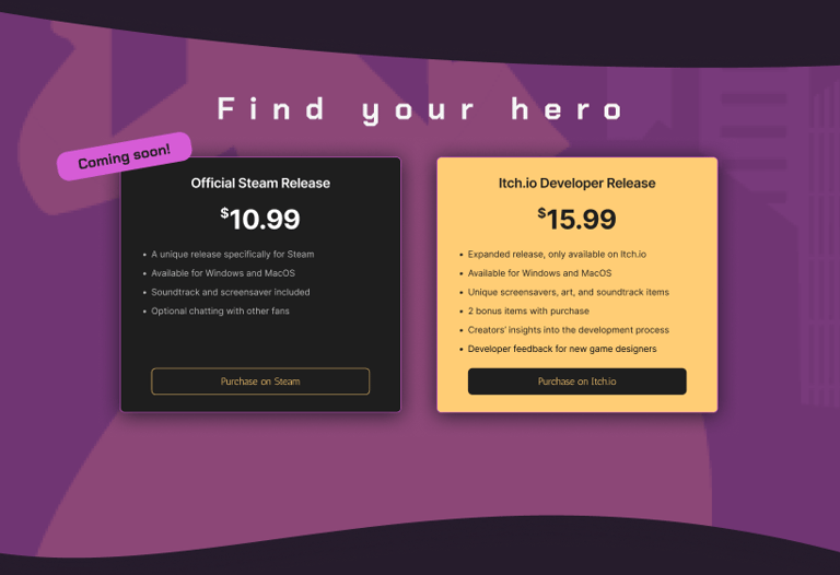
Purchase section with current offers -- Steam and Itch.io
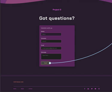
Feedback option with a form to contact the dev team, added at their request
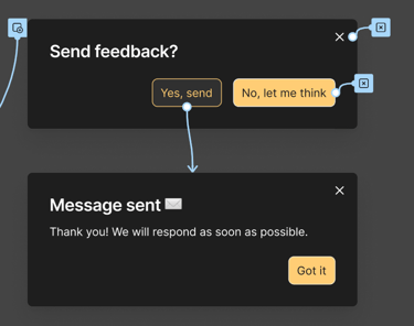
I set up flows, interactions, button state changes, and instance changes. In addition, I guided my client through every step of the way, requesting frequent feedback. I ensured the prototype aligned with their vision while reflecting the essence of the game and staying UX/UI-friendly and engaging for the players.
User Feedback & Adjustments
After the working Figma prototype was completed and approved, I conducted user testing and review to identify user pain points and friction issues. A total of 15 interviews were taken, during which I outlined 2 major roadblocks:
11 out of 15 users said they would prefer to read more about the game before pressing 'Buy now'.
7 out of 15 users said they wanted to be able to visit the game's Steam page to read more reviews and see the overall rating.
To tackle these issues, I added a 'Learn more' button under the hero section so the users could read more about the game before buying it. In the review section, I added a 'More reviews on Steam' link so the users could visit the game's Steam store page, if they were interested.
I'm open to opportunities
Let's talk! Reach out to me - I'm always happy to talk projects, startups, and more.
If you prefer, you can contact me on other platforms or by email:
Liubov Stepanishcheva © 2026